28 December 2011

Happy 2012


Happy year of the Dragon! Finally after sketch upon sketch the dragon nengajo is complete. I hope that I was able to send you one, if not I still wish you the best of luck in 2012 and if you send me your address you will definitely receive a 2013 nengajo in the post. I’ve been using the second image as my laptop background, so go ahead and use it too; it might bring you some good fortune.
I’ll leave you to contemplate these Chinese proverbs…
The dragon teaches you that if you want to climb high you have to do it against the wind.
To attract good fortune, spend a new coin on an old friend, share an old pleasure with a new friend, and lift up the heart of a true friend by writing his name on the wings of a dragon.
And last but not least
He who wants to be a dragon must eat many little snakes.
Happy snake eating!


10 December 2011

Nengajo


As it is coming to the end of the year, and I haven't posted anything for a while. I thought I should post some Nengajo (Japanese New Year Postcards). These cards were made mostly in Illustrator. The rabbit is from this year and the cat is from last year. Seeing as 2012 is the year of the dragon, I have been working on something cool, and this time round I'm having ago at a hand drawn picture. Come back before the years out, to check it out.


09 October 2011

Serengeti Bird Visual


Some very old Max work, in fact possibly my first attempt. During the first summer of university, to encourage us to become proficient at max we were asked to design and create a bird. The presentation was made with photos, Photoshop, Illustrator and of course 3DSmax.   


10 September 2011

New Jane Packer


Recently I have been working on an old project that never really got finished. You can see some Jane Packer branding work here; http://christopherwilliamcook.blogspot.com/2011/05/jane-packer-branding.html.

As a new project I am attempting an interior design for her flagship store in London. The original brief required the use of Corian; a resign based material that has antibacterial and easy clean properties. The concept just like that of the branding revolves around memories and photography. The window display will have large lenses focused on flowers and outline with circular ornamental frames... you'll have to wait for the 3D visuals, I'm onto it!
 
The paper size is A0 so you will have to zoom in to see the proper resolution.

18 July 2011

Miller Harris at Ab Rogers


Miller Harris is a world famous brand of perfume with store all over the word. The website can be found at this address www.millerharris.com. The brand was designed by the wonderful Asuka Kawabata (www.tokyobranch.jp) This model represents a stand that will sell perfume within the cosmetic section of department stores. It was designed at Ab Rogers (www.abrogers.com) and I was asked to make this model out of card and acrylic.


10 July 2011

New background

I probably should have also posted an image of the new background! Here it is.


09 July 2011

From old to new

Finally a new background, I hope the new one is just as appealing and easier on the eyes. The old background was designed with 2011 fashion trend in mind, bold prints and retro patterns. However I aimed to make the background more asymmetrical and opted to not use the neon colours that are also being pushed on the catwalk. The new background came about when I was looking in an old sketch book. I found a small piece of tracing paper with a print design I was working on at university. At that time I was researching textiles of the 1950s which drew inspiration from the current atom age. Many textiles had prints and weaves that symbolised cells, atoms... things looked at under a telescope.  The colouring however is inspired from Paul Klee's
 'Flowering' (1934)

03 July 2011

Future Plastics x Science Museum x Construction Details


As promised construction details!
Sometime in the near future I hope to change the blog background, I hope you have liked the current background and the you will like the new one just as much.


26 June 2011

Future Plastics x Science Museum


This Exhibition is set at the Science Museum. It focuses on the future of plastics, particularly that of plastic manufacture from genetically modified crops. The concept derives from a DNA strand, this forms the main walkways within the exhibition space, intractable screams and information panels are set within the display. Wireless devices and lighting set inside the display will be configurable from a distance or off site. For my next post I hope to upload some of the construction details drawn in CAD.

11 June 2011

Alice in Wonderland


One summer, the salmon pink tiles of my front garden really started to annoy me. So after a very short thought and a trip to Homebase, I spent half a day painting the ground and planting turf in reclaimed concrete pots. I'd like to think that somewhere in the back of my mind I had Alice in Wonderland as a concept. At the end of the day it was a quick and cheap job, it may not be wonderful, but thank good those salmon pink tiles have gone.


04 June 2011

Mini Cherished X Tamiya X Fitch


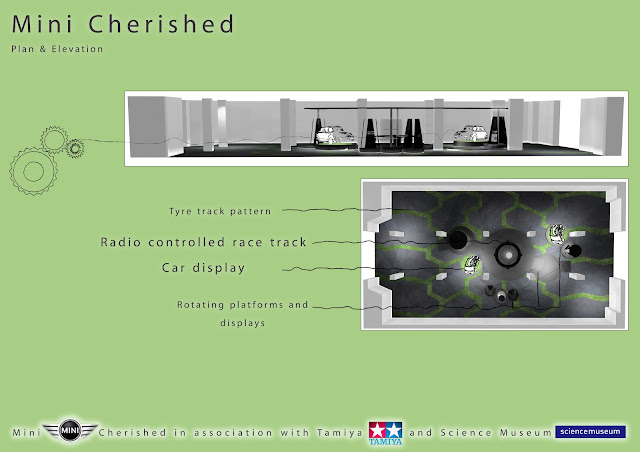
Mini Cherished was a design competition for a work placement at Fitch (www.fitch.com). The brief was a one week race to find a pair brand to go with Mini and design an exhibition space. Minis are often used as kit cars so I decided to design a joint exhibition with Tamiya the remote control car maker. These two brands have similarities in their fun and exiting approach and their reputation for quality. The exhibition space features a Tamiya race track and revolving platforms and displays connected by cogs spanning the room. The idea was that the visitors feel that they are inside a machine. The exhibition focuses on the history of the two companies as well as pointing out the benefits and possibilities of second hand Minis. Ideally the visitor walks away understanding the variety of customisations that can be made.

21 May 2011

Fashion Museum x Formica (Construction Detail)


During University we were required to produce construction detail drawings for all our work, for me this was an exciting part of design but posting all the drawings would likely bore you so I've selected two of ten from the Formica Fashion Museum project. The original post can be found here;
and concept models here;

08 May 2011

Flower Pug


Another postcard competition, the theme this time was flowers however I want to create something more quirky, the idea being that this character is some sort of flower creature. Drawn in illustrator the blades of grass suggest movement or wind blowing through a wild meadow.  

03 May 2011

Morphi's x 2


These are some promotional images from my final project Morphi's. The model was made using laser cut acrylic. It is a section of the building that shows the basement, ground and 1st floor. The visual made in Max is of the changing room and costume racks on the 1st floor.  

The site and business used in the design can be found here:
The first post with presentation board can be found here:

01 May 2011

Jane Packer Branding

 Logo 1
 Logo 2
 Wrapping 1
 Wrapping 2

Memory 1 
Memory 2


Jane Packer is one of the most influential floral designers of our time. She has shops and schools in London, New York, Tokyo and Seoul. During the 2nd year of university we teamed up and allocated tasks. Our goal was to create a fitting design for Jane Packer's flagship store in London. My task was to upgrade the brand without straying far from its original concept. This was difficult as the brand already has a deep history. One of my hopes was to modernize and make the brand more accessible to a wider range of clients.
The original logo is of three tulips, I took this very literally and exchanged the tulip print with photographs (scans of tulips). The outcome is very sensual and also has a hint of botanical art. I also attempted various types of wrapping, some of the best examples are bellow, they use the original logo repeated on a black background, that suggest a very trendy simplistic approach. Finally to tie in with the interior that other members had designed I suggested the use of customer's private photos to be displayed in the shop and used as tags on gifts. Flowers are given to people during events, and hold fond memories, the use of photos of loved ones brings a personal touch to the brand expressing the designer's wish to bring happy memories through her floral art.
During the summer I plan on attempting a shop design to accommodate this branding. Keep checking the blog for when I post my design.    


24 April 2011

Fashion Museum x Formica (Concept Model)


I found these photos of a concept model I made to determine the shape of the shelves and desk in the Fashion Museum. The concept and presentation boards can be found here.