Showing posts with label Graphics. Show all posts

25 March 2013

Pimp My Robo

Sorting out my apartment has really consumed my life. But today I gave myself some time and sat down to do some design work. Yes that's right I am working on new things! They may not be ready to present just yet but I have dug up this illustration to show you all while you wait. Well I say 'all', but in reality its probably one or two .
This Hand drawn Illustration is for a Kickstarter project that was successfully funded last year. This Kickstarter project was set up by a group of artist/illustrators and designer who get together weekly to draw comics. For those of you who are unfamiliar with Kickstarter, you set up a monetary goal to fund a project and ask people to pledge money. Once the goal is achieved, money is transferred to the group of people/ individual and the project begins. After days and weeks of drawing we successful completed and published our project. For those individuals who pledged there are certain awards/gifts. This particular drawing is a gift for a pledger who requested a robot looking dapper.
 
The details of our Kickstarter can be found here;
The Uzomuzo group website can be found here;
 
And Axiom Magazine which prints monthly and features Uzo Muzo can be found here;

06 January 2013

HAPPY NEW YEAR

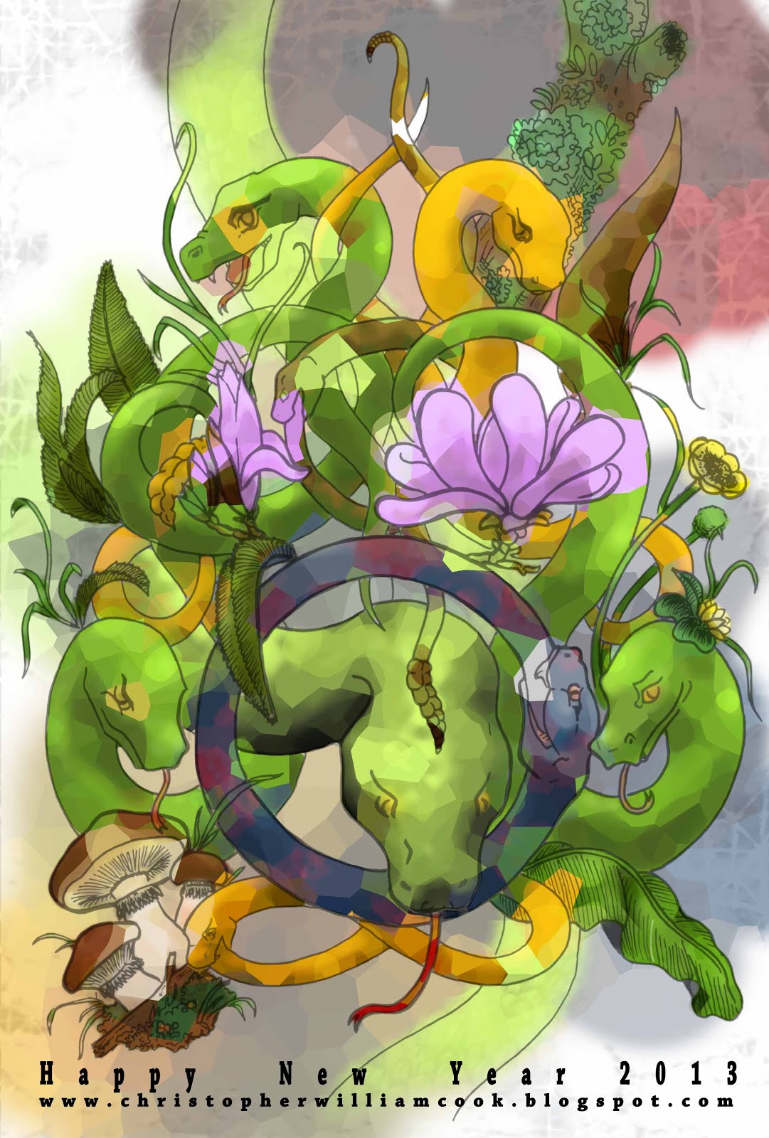
Happy new year everyone. As I’m sure you know; it is the year of the snake. Snakes are often perceived as bad omens, evil, sly or just scary, but in many cultures they resemble many virtues. Snakes are also associated with rebirth, eternity, patience, fertility, balance, communication, intuition, awareness, healing and protection.
 
I like to think therefore that this year of the snake will bring us all some kind of rebirth that will continue through out our lives.
 
Leaving the Hippy stuff aside, this year I wanted my new year card to be a lot more colourful. I used this project to practice using my tablet for colouring. I found it difficult to draw the snakes in a gentle way considering the stereo types that come with snakes. I tried to overcome this by using botanical art, symmetry and colour. The snakes eating themselves (Ouroboros) are an ancient Greek symbol that represents eternal renewal and cycle. The snake at the bottom is forming the symbol for infinity.


10 June 2012

More cards! it's about time I made a name card. And here it is.


It is obvious that font, lettering and information communication has been playing on my mind recently. Of course thinking up name cards is way to exciting so I'm sure I will think up a new one within the year. The card comprises of a paper clip and two pieces of paper. One side has my blog address and the other has my name and number hidden within the letters. The receiver must play with the card that has holes to reveal the details.


To go with the card is a new background design. I hope all the letters aren't giving you too much a migraine!


27 May 2012

Business cards

Branding can often be a complicated affair. Not only do you need to take into account the style and product of the client but also the client’s target audience. The ultimate goal of a simple design that is easily understood yet gives the viewer a depth of information at a glance, is notoriously difficult. Finally the icing on the cake, is the brand memorable?
 
For the particular card I wanted to create a sense of history and mystery. This is because the product, although modern, draws from hundreds of years of tradition.
Colouring and font are purposely kept simple and easy to read, the hint of an image should intrigue the viewer into having a closer look. The viewer may flip the card to see if the image is actually on the back. The image however is not on the back but within, only holding the card up to light will reveal the image.
I have blanket out address and contact details on the photos. In the future I hope to create a simple website in a similar style.


20 February 2012

What do you do in the train?

On a chockablock train one is likely to see people reading books, playing games, using phones, talking loudly and more often then not, making passes. Rarely however do I see people drawing. Until recently the odd glances I got when drawing made my notepad shy away, yet I have learnt that by focusing on the drawing I am able to shut out the world and speed up the passage of time. Give it a try!
Armed with my empty Muji diary and a long train journey; I started to think about fonts and different ways to represent text. I've found a really cool magazine in Japan called +81 that focuses on graphic design, layout and text, and it has inspired my to experiment.
Some fonts have the ability to slow down the reader making them dwell on key words whilst others, can have the effect of leading the viewer. Layout and font may be limitless however the fine line between tacky and cool is Hazardous. At university I remember everyone being scared to use anything other than Times or Arial. I'm unsure on the effect my diary fonts have, if any. But I'd love some feedback!


28 December 2011

Happy 2012


Happy year of the Dragon! Finally after sketch upon sketch the dragon nengajo is complete. I hope that I was able to send you one, if not I still wish you the best of luck in 2012 and if you send me your address you will definitely receive a 2013 nengajo in the post. I’ve been using the second image as my laptop background, so go ahead and use it too; it might bring you some good fortune.
I’ll leave you to contemplate these Chinese proverbs…
The dragon teaches you that if you want to climb high you have to do it against the wind.
To attract good fortune, spend a new coin on an old friend, share an old pleasure with a new friend, and lift up the heart of a true friend by writing his name on the wings of a dragon.
And last but not least
He who wants to be a dragon must eat many little snakes.
Happy snake eating!


10 December 2011

Nengajo


As it is coming to the end of the year, and I haven't posted anything for a while. I thought I should post some Nengajo (Japanese New Year Postcards). These cards were made mostly in Illustrator. The rabbit is from this year and the cat is from last year. Seeing as 2012 is the year of the dragon, I have been working on something cool, and this time round I'm having ago at a hand drawn picture. Come back before the years out, to check it out.


09 October 2011

Serengeti Bird Visual


Some very old Max work, in fact possibly my first attempt. During the first summer of university, to encourage us to become proficient at max we were asked to design and create a bird. The presentation was made with photos, Photoshop, Illustrator and of course 3DSmax.   


10 July 2011

New background

I probably should have also posted an image of the new background! Here it is.


09 July 2011

From old to new

Finally a new background, I hope the new one is just as appealing and easier on the eyes. The old background was designed with 2011 fashion trend in mind, bold prints and retro patterns. However I aimed to make the background more asymmetrical and opted to not use the neon colours that are also being pushed on the catwalk. The new background came about when I was looking in an old sketch book. I found a small piece of tracing paper with a print design I was working on at university. At that time I was researching textiles of the 1950s which drew inspiration from the current atom age. Many textiles had prints and weaves that symbolised cells, atoms... things looked at under a telescope.  The colouring however is inspired from Paul Klee's
 'Flowering' (1934)

08 May 2011

Flower Pug


Another postcard competition, the theme this time was flowers however I want to create something more quirky, the idea being that this character is some sort of flower creature. Drawn in illustrator the blades of grass suggest movement or wind blowing through a wild meadow.  

03 May 2011

Morphi's x 2


These are some promotional images from my final project Morphi's. The model was made using laser cut acrylic. It is a section of the building that shows the basement, ground and 1st floor. The visual made in Max is of the changing room and costume racks on the 1st floor.  

The site and business used in the design can be found here:
The first post with presentation board can be found here:

01 May 2011

Jane Packer Branding

 Logo 1
 Logo 2
 Wrapping 1
 Wrapping 2

Memory 1 
Memory 2


Jane Packer is one of the most influential floral designers of our time. She has shops and schools in London, New York, Tokyo and Seoul. During the 2nd year of university we teamed up and allocated tasks. Our goal was to create a fitting design for Jane Packer's flagship store in London. My task was to upgrade the brand without straying far from its original concept. This was difficult as the brand already has a deep history. One of my hopes was to modernize and make the brand more accessible to a wider range of clients.
The original logo is of three tulips, I took this very literally and exchanged the tulip print with photographs (scans of tulips). The outcome is very sensual and also has a hint of botanical art. I also attempted various types of wrapping, some of the best examples are bellow, they use the original logo repeated on a black background, that suggest a very trendy simplistic approach. Finally to tie in with the interior that other members had designed I suggested the use of customer's private photos to be displayed in the shop and used as tags on gifts. Flowers are given to people during events, and hold fond memories, the use of photos of loved ones brings a personal touch to the brand expressing the designer's wish to bring happy memories through her floral art.
During the summer I plan on attempting a shop design to accommodate this branding. Keep checking the blog for when I post my design.    


02 April 2011

Tsukuru Market Flier No*4


Last year I worked at M28E/Tsukuru, were I was able to get a diverse range of experiences. The company, which originally was a garden design company is ever expanding into new fields. During my time there we designed many events, festivals, exhibitions, and even a stage set. This particular flier I designed for a Market held twice a year in the Tsukuru building. The event held more then 40 stalls, including music, food, therapies and hand crafted goods. The fliers were handed out at local shops and stations. Although my time at M28E was short, the experience I had was truly enlightening. Not to mention the kind and friendly people I am so lucky to have met. Check out their website and projects at: http://m28e.jp/tsukuru/   


24 March 2011

Moon


This is a book cover competition from last winter. It didn't win top prize but it reached third tier, which I am proud of as 10 thousand applicants entered across Japan. The theme is 'moon'.