Showing posts with label Concept. Show all posts
27 January 2015
06 January 2013
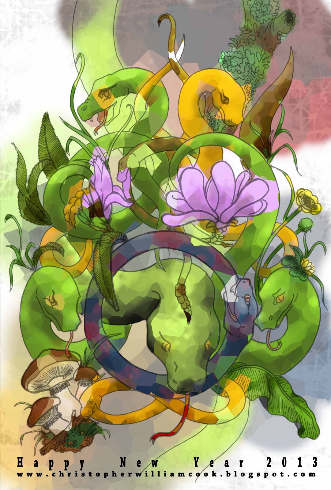
HAPPY NEW YEAR
Happy new year everyone. As I’m sure you know; it is the
year of the snake. Snakes are often perceived as bad omens, evil, sly or just
scary, but in many cultures they resemble many virtues. Snakes are also
associated with rebirth, eternity, patience, fertility, balance, communication,
intuition, awareness, healing and protection.
I like to think therefore that this year of the snake will
bring us all some kind of rebirth that will continue through out our lives.
Leaving the Hippy stuff aside, this year I wanted my new
year card to be a lot more colourful. I used this project to practice using my
tablet for colouring. I found it difficult to draw the snakes in a gentle way
considering the stereo types that come with snakes. I tried to overcome this by
using botanical art, symmetry and colour. The snakes eating themselves
(Ouroboros) are an ancient Greek symbol that represents eternal renewal and
cycle. The snake at the bottom is forming the symbol for infinity.
29 August 2012
Jane Packer
A second attempt at Jane Packer’s flagship store in London proved to be a
challenge. Not being able to visit the site and trying to remember the layout
from over 4 years ago was not the easiest task. Reference photos were pulled up
from the deepest depth of my hard drive, old sketch books were dusted off and
ancient emails were excavated. Finally the visuals have arrived.
About the brand and concept.
Jane Packer is revered in florist circles for being
influential in contemporary arrangements, its customers believe it to be a trustworthy,
long-lived brand of high quality. Many newer flower designers have gone for a
more playful and vivid approach, were as Jane Packer has kept a feel of luxury
and minimalism. Its branding not only focuses on this sense of quality but also
a feel of romance and relationships between people.
About the interior.
Keeping that sense of quality and simplistic the interior is
practically a concrete box. The walls have been stamped with a wood print for a
classical feel. The floor polished for easy of cleaning and light reflection.
The ceiling has been left rough and painted black to give
the impression of an ongoing void and also to accentuate the floating mirror
ceiling that bends round the space. All lighting, wiring and air conditioning
units are hidden behind this ceiling. The mirrored ceiling works to make the
space seem bigger and divide the room to create a small preparation space at
the back of the shop.
Furniture in the space is inspired by classic bombe dresser
with an asymmetrical angular twist. The most important product within the shop
is obviously the flowers. They have been turned into centrepieces framed my
massive circular frames and enlarged by an array of magnifying glasses.
Have a look at these older post of the plan
and some
branding
(http://www.christopherwilliamcook.blogspot.jp/2011/05/jane-packer-branding.html) to help better understand the space.
Also be sure to check out Jane
packer’s website for images of her Olympic flower bouquets (http://www.jane-packer.co.uk/).
21 July 2012
Thames Moon Olympics
In light of the Olympics I’ve dug deep into my hard drive to
find this project. The Thames Moon is an object that sits in the Thames . As the Thames ’
tide falls gravity works within the object to filter water. Compared to the
overall filth of the Thames such a processes
will hardly make a difference to the cleanliness of the river however the
object’s purpose is more than a filtration system. It aims to bring attention
to the Thames and the space that is created
everyday between the tides, it encourages the citizens to be more thoughtful
about the river and celebrates the fact that the river is slowly improving and
now supports aquatic life. It reminds us that the city of London
was built around the Thames, without it, it is unlikely London would exist. Thames Moon generates
electricity using both the tide and solar energy for its lighting. Careful
thought has been put into its position and shape so as to minimise the effect
it has on water flow and to increase its visibility to passersby.
Labels:
Architecture,
Art,
Concept,
Design,
Fun,
Information,
Object,
Olympics,
Visual,
Work
10 June 2012
More cards! it's about time I made a name card. And here it is.
It is obvious that font, lettering and information communication has been playing on my mind recently. Of course thinking up name cards is way to exciting so I'm sure I will think up a new one within the year. The card comprises of a paper clip and two pieces of paper. One side has my blog address and the other has my name and number hidden within the letters. The receiver must play with the card that has holes to reveal the details.
To go with the card is a new background design. I hope all the letters aren't giving you too much a migraine!
Labels:
Background,
Blog,
Branding,
Business Card,
Concept,
Design,
Drawing,
Font,
Fun,
Graphics,
Information,
Logo,
Visual,
Work
27 May 2012
Business cards
Branding can often be a complicated affair. Not only do you
need to take into account the style and product of the client but also the
client’s target audience. The ultimate goal of a simple design that is easily
understood yet gives the viewer a depth of information at a glance, is
notoriously difficult. Finally the icing on the cake, is the brand memorable?
For the particular card I wanted to create a sense of
history and mystery. This is because the product, although modern, draws from hundreds
of years of tradition.
Colouring and font are purposely kept simple and easy to
read, the hint of an image should intrigue the viewer into having a closer
look. The viewer may flip the card to see if the image is actually on the back.
The image however is not on the back but within, only holding the card up to
light will reveal the image.
I have blanket out address and contact details on the
photos. In the future I hope to create a simple website in a similar style.
20 February 2012
What do you do in the train?
On a chockablock train one is likely to see people reading books, playing games, using phones, talking loudly and more often then not, making passes. Rarely however do I see people drawing. Until recently the odd glances I got when drawing made my notepad shy away, yet I have learnt that by focusing on the drawing I am able to shut out the world and speed up the passage of time. Give it a try!
Armed with my empty Muji diary and a long train journey; I started to think about fonts and different ways to represent text. I've found a really cool magazine in Japan called +81 that focuses on graphic design, layout and text, and it has inspired my to experiment.
Some fonts have the ability to slow down the reader making them dwell on key words whilst others, can have the effect of leading the viewer. Layout and font may be limitless however the fine line between tacky and cool is Hazardous. At university I remember everyone being scared to use anything other than Times or Arial. I'm unsure on the effect my diary fonts have, if any. But I'd love some feedback!
10 December 2011
Nengajo
As it is coming to the end of the year, and I haven't posted anything for a while. I thought I should post some Nengajo (Japanese New Year Postcards). These cards were made mostly in Illustrator. The rabbit is from this year and the cat is from last year. Seeing as 2012 is the year of the dragon, I have been working on something cool, and this time round I'm having ago at a hand drawn picture. Come back before the years out, to check it out.
09 July 2011
From old to new
Finally a new background, I hope the new one is just as appealing and easier on the eyes. The old background was designed with 2011 fashion trend in mind, bold prints and retro patterns. However I aimed to make the background more asymmetrical and opted to not use the neon colours that are also being pushed on the catwalk. The new background came about when I was looking in an old sketch book. I found a small piece of tracing paper with a print design I was working on at university. At that time I was researching textiles of the 1950s which drew inspiration from the current atom age. Many textiles had prints and weaves that symbolised cells, atoms... things looked at under a telescope. The colouring however is inspired from Paul Klee's
'Flowering' (1934)
26 June 2011
Future Plastics x Science Museum
This Exhibition is set at the Science Museum . It focuses on the future of plastics, particularly that of plastic manufacture from genetically modified crops. The concept derives from a DNA strand, this forms the main walkways within the exhibition space, intractable screams and information panels are set within the display. Wireless devices and lighting set inside the display will be configurable from a distance or off site. For my next post I hope to upload some of the construction details drawn in CAD.
11 June 2011
Alice in Wonderland
One summer, the salmon pink tiles of my front garden really started to annoy me. So after a very short thought and a trip to Homebase, I spent half a day painting the ground and planting turf in reclaimed concrete pots. I'd like to think that somewhere in the back of my mind I had Alice in Wonderland as a concept. At the end of the day it was a quick and cheap job, it may not be wonderful, but thank good those salmon pink tiles have gone.
08 May 2011
Flower Pug
Another postcard competition, the theme this time was flowers however I want to create something more quirky, the idea being that this character is some sort of flower creature. Drawn in illustrator the blades of grass suggest movement or wind blowing through a wild meadow.
24 April 2011
Fashion Museum x Formica (Concept Model)
I found these photos of a concept model I made to determine the shape of the shelves and desk in the Fashion Museum . The concept and presentation boards can be found here.