29 August 2012

Jane Packer


A second attempt at Jane Packer’s flagship store in London proved to be a challenge. Not being able to visit the site and trying to remember the layout from over 4 years ago was not the easiest task. Reference photos were pulled up from the deepest depth of my hard drive, old sketch books were dusted off and ancient emails were excavated. Finally the visuals have arrived.
 
                About the brand and concept.
 
Jane Packer is revered in florist circles for being influential in contemporary arrangements, its customers believe it to be a trustworthy, long-lived brand of high quality. Many newer flower designers have gone for a more playful and vivid approach, were as Jane Packer has kept a feel of luxury and minimalism. Its branding not only focuses on this sense of quality but also a feel of romance and relationships between people.
 
                        About the interior.
 
Keeping that sense of quality and simplistic the interior is practically a concrete box. The walls have been stamped with a wood print for a classical feel. The floor polished for easy of cleaning and light reflection.
 
The ceiling has been left rough and painted black to give the impression of an ongoing void and also to accentuate the floating mirror ceiling that bends round the space. All lighting, wiring and air conditioning units are hidden behind this ceiling. The mirrored ceiling works to make the space seem bigger and divide the room to create a small preparation space at the back of the shop. 
 
Furniture in the space is inspired by classic bombe dresser with an asymmetrical angular twist. The most important product within the shop is obviously the flowers. They have been turned into centrepieces framed my massive circular frames and enlarged by an array of magnifying glasses. 
 
Have a look at these older post of the plan
and some branding
 
Also be sure to check out Jane packer’s website for images of her Olympic flower bouquets (http://www.jane-packer.co.uk/).

21 July 2012

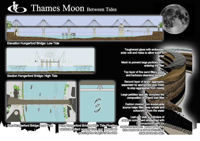
Thames Moon Olympics

In light of the Olympics I’ve dug deep into my hard drive to find this project. The Thames Moon is an object that sits in the Thames. As the Thames’ tide falls gravity works within the object to filter water. Compared to the overall filth of the Thames such a processes will hardly make a difference to the cleanliness of the river however the object’s purpose is more than a filtration system. It aims to bring attention to the Thames and the space that is created everyday between the tides, it encourages the citizens to be more thoughtful about the river and celebrates the fact that the river is slowly improving and now supports aquatic life. It reminds us that the city of London was built around the Thames, without it, it is unlikely London would exist. Thames Moon generates electricity using both the tide and solar energy for its lighting. Careful thought has been put into its position and shape so as to minimise the effect it has on water flow and to increase its visibility to passersby.


10 June 2012

More cards! it's about time I made a name card. And here it is.


It is obvious that font, lettering and information communication has been playing on my mind recently. Of course thinking up name cards is way to exciting so I'm sure I will think up a new one within the year. The card comprises of a paper clip and two pieces of paper. One side has my blog address and the other has my name and number hidden within the letters. The receiver must play with the card that has holes to reveal the details.


To go with the card is a new background design. I hope all the letters aren't giving you too much a migraine!


27 May 2012

Business cards

Branding can often be a complicated affair. Not only do you need to take into account the style and product of the client but also the client’s target audience. The ultimate goal of a simple design that is easily understood yet gives the viewer a depth of information at a glance, is notoriously difficult. Finally the icing on the cake, is the brand memorable?
 
For the particular card I wanted to create a sense of history and mystery. This is because the product, although modern, draws from hundreds of years of tradition.
Colouring and font are purposely kept simple and easy to read, the hint of an image should intrigue the viewer into having a closer look. The viewer may flip the card to see if the image is actually on the back. The image however is not on the back but within, only holding the card up to light will reveal the image.
I have blanket out address and contact details on the photos. In the future I hope to create a simple website in a similar style.


20 February 2012

What do you do in the train?

On a chockablock train one is likely to see people reading books, playing games, using phones, talking loudly and more often then not, making passes. Rarely however do I see people drawing. Until recently the odd glances I got when drawing made my notepad shy away, yet I have learnt that by focusing on the drawing I am able to shut out the world and speed up the passage of time. Give it a try!
Armed with my empty Muji diary and a long train journey; I started to think about fonts and different ways to represent text. I've found a really cool magazine in Japan called +81 that focuses on graphic design, layout and text, and it has inspired my to experiment.
Some fonts have the ability to slow down the reader making them dwell on key words whilst others, can have the effect of leading the viewer. Layout and font may be limitless however the fine line between tacky and cool is Hazardous. At university I remember everyone being scared to use anything other than Times or Arial. I'm unsure on the effect my diary fonts have, if any. But I'd love some feedback!