21 May 2011

Fashion Museum x Formica (Construction Detail)


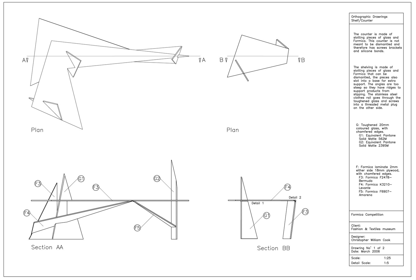
During University we were required to produce construction detail drawings for all our work, for me this was an exciting part of design but posting all the drawings would likely bore you so I've selected two of ten from the Formica Fashion Museum project. The original post can be found here;
and concept models here;

08 May 2011

Flower Pug


Another postcard competition, the theme this time was flowers however I want to create something more quirky, the idea being that this character is some sort of flower creature. Drawn in illustrator the blades of grass suggest movement or wind blowing through a wild meadow.  

03 May 2011

Morphi's x 2


These are some promotional images from my final project Morphi's. The model was made using laser cut acrylic. It is a section of the building that shows the basement, ground and 1st floor. The visual made in Max is of the changing room and costume racks on the 1st floor.  

The site and business used in the design can be found here:
The first post with presentation board can be found here:

01 May 2011

Jane Packer Branding

 Logo 1
 Logo 2
 Wrapping 1
 Wrapping 2

Memory 1 
Memory 2


Jane Packer is one of the most influential floral designers of our time. She has shops and schools in London, New York, Tokyo and Seoul. During the 2nd year of university we teamed up and allocated tasks. Our goal was to create a fitting design for Jane Packer's flagship store in London. My task was to upgrade the brand without straying far from its original concept. This was difficult as the brand already has a deep history. One of my hopes was to modernize and make the brand more accessible to a wider range of clients.
The original logo is of three tulips, I took this very literally and exchanged the tulip print with photographs (scans of tulips). The outcome is very sensual and also has a hint of botanical art. I also attempted various types of wrapping, some of the best examples are bellow, they use the original logo repeated on a black background, that suggest a very trendy simplistic approach. Finally to tie in with the interior that other members had designed I suggested the use of customer's private photos to be displayed in the shop and used as tags on gifts. Flowers are given to people during events, and hold fond memories, the use of photos of loved ones brings a personal touch to the brand expressing the designer's wish to bring happy memories through her floral art.
During the summer I plan on attempting a shop design to accommodate this branding. Keep checking the blog for when I post my design.