30 March 2011

Model Making at Ab Rogers (Emperor Moth)


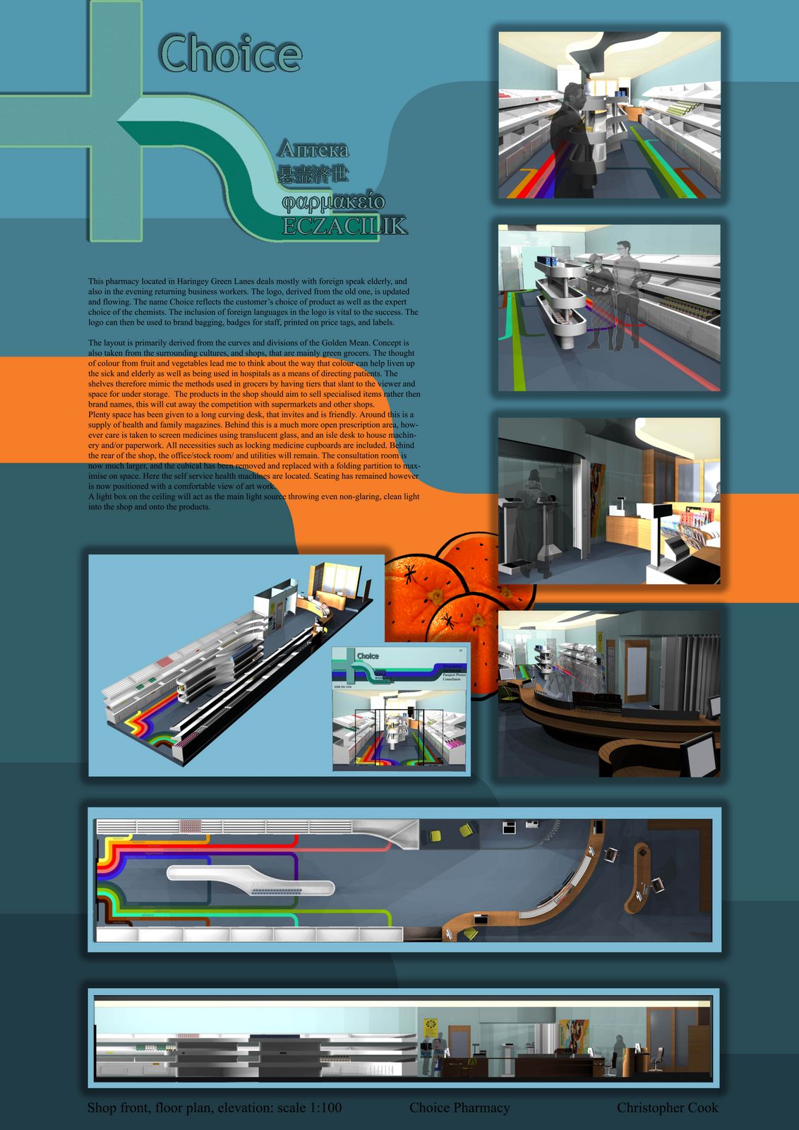
During University I had the pleasure of working at Ab Rogers (http://www.abrogers.com/). These photos are of a design for a Moscow boutique Emperor Moth, the interior is a crazy shatter of reflecting mirrors that makes you feel as if you are floating within a crystal. The pink outlines are representative of both Emperor Moth's and Ab's flamboyant style.
On this project I helped make the construction model. It was the most exciting and difficult model I have ever experienced. The model was mainly for the constructors, and worked as a blue print or reference so that constructing the abstract space went smoothly.

The model was first drawn in a free 3D program, then it was printed to scale, splayed out on a piece of paper with a code on each component, meanwhile each component was laser cut, sprayed and joined using the printout as a reference. The model sits in a supporting frame which easily shows the numbers of each panel on the back and assisted the constructors.   

28 March 2011

Morphi's


Morphi's was my final project. The Morphi building reacts to light, pressure, wind and movement. The basement space has been designed into a bar, the Ground floor reception and shop and the 1st floor costume hire. The above floors are office and workshop. Accompanying this A0 board were several plan and detail drawings done in CAD and an acrylic model of the bar, shop and changing rooms. The visuals were made with 3DSmax, Photoshop and Illustrator. This project was lucky enough to be displayed at the New Designers Show in the Business Design Centre located in Angel and Islington. The site and business used in the design can be found here: http://www.madworldfancydress.com/

26 March 2011

Pharmacy Interior


Choice Pharmacy was a 2nd year university project. For inspiration I looked at the colourful fruit and vegetable shops abundant in the area. The aim was to help people find the item they were looking for, so burrowing display methods from grocery stores, stations and hospitals this design was born. The golden section was applied to the overall floor plan.

The design includes a private space for consultation, weighing and piercing, lockable medicine cabinets for safety, a large counter to accommodate many tills, bright lighting from a light box on the ceiling, colour coded sections, magazine and leaflet rack and hygienic easy clean materials. The logo includes the most common language in the area and represents also the diversity of the staff working in the pharmacy. 

24 March 2011

Moon


This is a book cover competition from last winter. It didn't win top prize but it reached third tier, which I am proud of as 10 thousand applicants entered across Japan. The theme is 'moon'.

23 March 2011

Fashion Museum x Formica


For the first post I chose one of my favourite projects during university. I feel now that I look back on the presentation boards, the interior could use a little detailing. The space is a combined coffee/souvenir shop in London's Fashion Museum. As part of the Formica competition the brief required the use of Formica materials, most of witch are plastic and wood veneers. For the shop displays and coffee shop seating Formica in bold colours has been united with coloured glass in asymmetrical angular shapes. The concept was derived from crystalline structures and flamboyant fashions that can be seen in the museums collection.